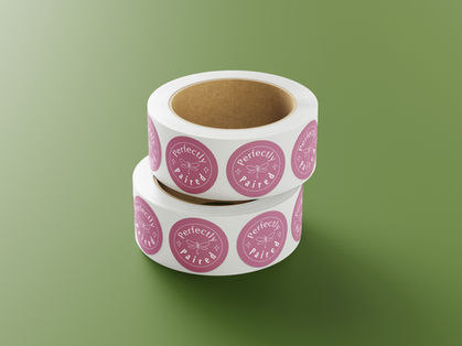
Perfectly Paired Logo and Branding Design
When I partnered with the founder of Perfectly Paired, the goal was to create a brand identity that felt as thoughtful and curated as the products themselves. Guided by keywords like luxury, dragonfly, simple yet eye-catching, and family, I set out to design a visual identity that balanced elegance with warmth. The result was a whimsical dragonfly logo, paired with refined typography. I built the color palette around a darker sage green, gentle blush pink, and rich plum tones, drawing inspiration from earthy marsh hues that reflect calm, connection, and natural beauty. These tones not only grounded the brand in an organic, luxurious feel but also tied into the dragonfly’s symbolism of harmony and grace. Inspired by high-end baby and lifestyle brands, I created an identity that feels luxurious yet heartfelt, imaginative yet grounded, a brand that celebrates meaningful gift-giving.


